RU
EN
🔍
Categories
▼
•
Vehicles
•
Fashion
•
Recipes
•
Blogs
•
Hunt
•
Travels
•
Sport
•
Fun
•
Handmade
•
IT
•
Education
Mini-Games
x
x
zakruti.com
»
Knowledge, science, education
»
Technology for Teachers and Students
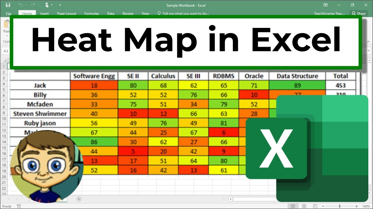
Create a Heat Map in Excel
FB
Twitter
Reddit
video description
Rating:
4.0
; Vote:
1
Learn how to create a Heat Map effect in your Excel data. This technique helps to quickly draw attention to what the data means, even at a glance
Date: 2022-04-08
←
Using Linked Data Types in Excel
Easily Insert Charts and PivotTables into Excel with Analyze Data Button
→
Related videos
Why did the Vikings become Christians
•
Knowledgia
The Entire History of Ancient Greece (3000 BC - 146 BC) - Full Documentary
•
Knowledgia
Why did the East Try to Reconquer the West
•
Knowledgia
F1 Chief Mechanic Answers F1 Car Questions - Tech Support - WIRED
•
WIRED
Have you ever had an imaginary friend Watch this
•
TED-Ed
Iran 2026: la guerra spacciata per liberazione
•
Nova Lectio
Add a review, comment
Other channel videos
7:12
Using PowerPoint Add-Ins
9:38
Adding Videos to PowerPoint Presentations
13:11
Advanced Excel - Creating Pivot Tables in Excel
7:10
Advanced Excel - Flash Fill Tutorial
14:0
The NEW Google Calendar
4:9
Top 5 Favorite Teacher Technology Websites in 2017
11:3
Biteable Tutorial - World's Simplest Video Maker
11:49
Uploading Your Music to Google Play Music Library
14:6
Blended Play Tutorial - Customizable Educational Games
5:40
Canvas LMS - Creating Custom Navigation Buttons