Why you Should Learn Color and Structure - Checklist Critiques - Proko
video description
Date: 2022-03-14
Related videos


Comments and reviews: 10
Harry
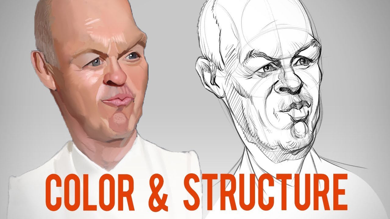
Like many others, I was also surprised to see that the likeness got lost almost completely in the correction. The students work was spot on with all the small asymms and little unevenesses imho, as well with some of the bigger forms. It wouldnt be a problem and would be understandable, if the corrector would admit at some point that it was jus a structural correction and that he had lost the likeness on the way. But instead its continously stated throughout the vid that he extends upon the original and corrects it as a whole, even saying -caricaturing it a little bit more-. Thats where the credibility gets lost, I guess. I think no one would be making a big deal out of it in the comments if that would have happened. It then would be great to see how even professionals are not working like machines and are not able to create the results they want all the time. : ) It would be enjoyable. But how it is now it jus appears a bit boastful.
reply
Like many others, I was also surprised to see that the likeness got lost almost completely in the correction. The students work was spot on with all the small asymms and little unevenesses imho, as well with some of the bigger forms. It wouldnt be a problem and would be understandable, if the corrector would admit at some point that it was jus a structural correction and that he had lost the likeness on the way. But instead its continously stated throughout the vid that he extends upon the original and corrects it as a whole, even saying -caricaturing it a little bit more-. Thats where the credibility gets lost, I guess. I think no one would be making a big deal out of it in the comments if that would have happened. It then would be great to see how even professionals are not working like machines and are not able to create the results they want all the time. : ) It would be enjoyable. But how it is now it jus appears a bit boastful.
reply
Colorful
Wow, so many condescending comments here. Many claim that the students drawing was better because it had more likeness, but I honestly think the teacher did it way better. The students drawing was obviously not well proportioned and it made it look really weird. He just corrected his structure and it actually looked better. Also let's not forget this is supposed to be a caricature which means that, sure it still needs to resemble the person while exaggerating other features, but that's no excuse for bad structure.
And it's also not fair to compare just a sketch with an all out painting. I bet that if he painted it, people could see the likeness better.
reply
Wow, so many condescending comments here. Many claim that the students drawing was better because it had more likeness, but I honestly think the teacher did it way better. The students drawing was obviously not well proportioned and it made it look really weird. He just corrected his structure and it actually looked better. Also let's not forget this is supposed to be a caricature which means that, sure it still needs to resemble the person while exaggerating other features, but that's no excuse for bad structure.
And it's also not fair to compare just a sketch with an all out painting. I bet that if he painted it, people could see the likeness better.
reply
Danaya
Lost the likeness because of the lips looking too thick and, the nose is the wrong shape (the nostril specifically is too visible and large) and the eyes are too. not squinty enough, as well as the relationship between the eyebrows and the eyes. The revision has eyebrows that are too arched. The cheekbone maybe too should protrude more. Lots of little stuff but those are what makes the likeness happen. I would not have looked at it and seen Keaton.
reply
Lost the likeness because of the lips looking too thick and, the nose is the wrong shape (the nostril specifically is too visible and large) and the eyes are too. not squinty enough, as well as the relationship between the eyebrows and the eyes. The revision has eyebrows that are too arched. The cheekbone maybe too should protrude more. Lots of little stuff but those are what makes the likeness happen. I would not have looked at it and seen Keaton.
reply
Martin
Could you or Stan do a FULL VIDEO JUST ABOUT THE REILLY METHOD? Like step-by-step? I've seen a few of yours where you use it, but no one from the Watts ecosystem has actually gone through it explicitly and explained it. Is this a premium-section thing? No video that I've looked up has been adequate, and no book has either. It's like every one that uses it just knows it from some class that I can't find!
reply
Could you or Stan do a FULL VIDEO JUST ABOUT THE REILLY METHOD? Like step-by-step? I've seen a few of yours where you use it, but no one from the Watts ecosystem has actually gone through it explicitly and explained it. Is this a premium-section thing? No video that I've looked up has been adequate, and no book has either. It's like every one that uses it just knows it from some class that I can't find!
reply
Threefive
Loses the likeness because his nose is very smooth, a clear line from eyebrows down. You can see him breaking the rhythm line. Also his facial features are small on his face, with barely there cheekbones. His pout is not sticking his lips forward, it's sucking his lips together. Overall, the final drawing added too much generous structure to a very strained/tight face.
reply
Loses the likeness because his nose is very smooth, a clear line from eyebrows down. You can see him breaking the rhythm line. Also his facial features are small on his face, with barely there cheekbones. His pout is not sticking his lips forward, it's sucking his lips together. Overall, the final drawing added too much generous structure to a very strained/tight face.
reply
Pepijn
Tries to fix structural issues, barely does so. introduces new ones. Great! Especially how the mouth now clearly exists on a different plane than the rest of the face. I get it though, trying to fix issues of a drawing while painting over it can be rather difficult to not be influenced by what's underneath. So it's usually better to just avoid that and start blank.
reply
Tries to fix structural issues, barely does so. introduces new ones. Great! Especially how the mouth now clearly exists on a different plane than the rest of the face. I get it though, trying to fix issues of a drawing while painting over it can be rather difficult to not be influenced by what's underneath. So it's usually better to just avoid that and start blank.
reply
TheMoonPrincess2
I actually do like the professor's take better. I think the original work (which was already great by the way, Im not contesting that) was too hesitant in exaggerating the features, which the final version made up for.
reply
I actually do like the professor's take better. I think the original work (which was already great by the way, Im not contesting that) was too hesitant in exaggerating the features, which the final version made up for.
reply
Juan
I would've liked to see the submitted caricature without the color, only the drawing underneath. I think it looks more alike the subject in the photo than the one at the end. Great video!
reply
I would've liked to see the submitted caricature without the color, only the drawing underneath. I think it looks more alike the subject in the photo than the one at the end. Great video!
reply
Ryan
I love watching professionals work, I feel like I am picking up great tips on expressions and the structure of faces even though I don't do caricature. Thanks for these awesome videos.
reply
I love watching professionals work, I feel like I am picking up great tips on expressions and the structure of faces even though I don't do caricature. Thanks for these awesome videos.
reply
Johnny
I am very very impressed. I think I will sign up for the premium course if I can pay it. Took four classes in portrait painting but learn more here in one internet session.
reply
I am very very impressed. I think I will sign up for the premium course if I can pay it. Took four classes in portrait painting but learn more here in one internet session.
reply
Add a review, comment
Other channel videos