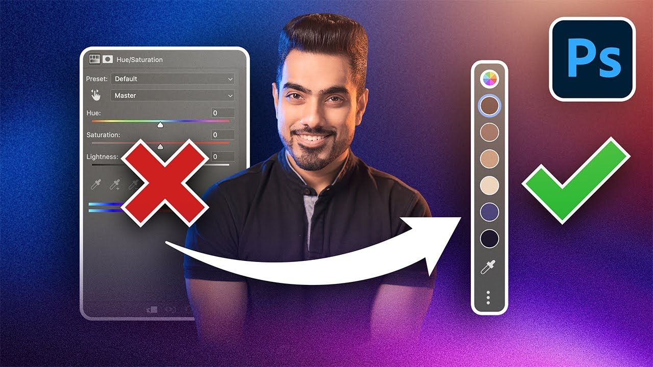
The End of Old Hue/Saturation Photoshop's Big Update
video description
Date: 2025-03-14
Related videos


Comments and reviews: 20
markThaSon
I laugh at so many people who come with this Adobe is DEAD!, Photoshop Killer! kind of views and videos, just because they've seen another software that has copied a feature and improved it. You have to admit, Photoshop has been ahead of the crowd for decades now. EVeryone else is building off of their foundation. To lead in innovation is not easy. Of course people will always use you as a yard stick to improve themselves and yet claim superiority over you. I understand they are enjoying monopoly and all, and people may not be happy with their sub charges and all, but you have to acknowledge how prominent it has been in making high-level tech easily accessible to common market. Maybe some creatives have not been around for long, so they don't appreciate when such tools was for an exclusive few in top industries. Look at how indispensible tools like Photoshop have become in the creative space. You think it'll just take alternatives to kill them. With this kind of updates, they'll keep being a step ahead of all.
reply
JOEMDMD
I tried using it to edit my landscape photos, such as a sunset scene. It selected the prominent colors for me, but they all had the same yellow tone, just with different brightness levels. I wanted the hue of the brighter and darker areas to have a slight offset to create a more dramatic effect, but it was clearly not achievable. Since their tones were essentially the same, adjusting any randomly selected color block would also affect others with different brightness levels, making it feel like a global adjustment. I hope that subtle colors like these can be adjusted independently without affecting each other.
reply
krectus
2:46 Seems like it's still a pretty big fail here, unable to change the colour of the jacket without having to manual go and adjust the sliders and hope you've got the range right, same thing with changing the red in the background, not really telling you which pixels are being changed, no visual indicator so it's really easy to change the skin tone by accident. Still a long way to go for a more user friendly way of color selecting and adjusting. Not sure how this is any easier than just using the eyedropper and picking the color that way.
reply
harryvuemedia
Now this new feature is very helpful!!!
I usually edit skin tones in Photoshop and i dislike the fact that we only have 2 colors to choose from which are Yellow or Red. In Lightroom, skin tone is Orange so I have better control over it. But in photoshop, I have to make so much more just to adjust skin tones because there is no Orange color in Hue Saturation. So changing Red will effect other colors and vice versa with Yellow.
With this new Hue Saturation feature, it will make it so mcuh easier for me to edit skin tones now.
reply
SeventhDeven
Heck, yes! I'll absolutely use the updated Hue & Saturation layer once this feature comes out.
I've seen the technique where a designer selects an area within a photo and then uses a solid color and paints a mask over it. Then, they would switch the blend mode to Hue. I've used that technique before, but I can't remember which design I used it on.
Most of the time, I clip a gradient adjustment layer onto a graphic element and I will set whichever blend mode looks the best.
reply
1mGotcha
Hey Umesh! Could you make a video on HOW TO BECOME LIKE ME I know it sounds a bit silly, but you really inspire me and a few others. I want to start filming videos like you! Your background, those cool microphones, and your camera setup are awesome. It’s a bit different from your usual content, but I’d love to see how you set everything up in your studio. Thanks!
reply
piximperfect
What happens when you put a mask on the adjustment layer Do the swatches update accordingly Lets say you have a photo of 2 people: red shirt on the left of the picture and blue shirt on the right of the picture. Add a hue/saturation layer. The preview swatches should show Red and Blue. Add a mask to the left side of the image. Does the Red swatch go away
reply
Mohim_Mohim
We messaged Adobe Photoshop Team many times but Adobe Team does not add this feature PixImperfact If we tell this to Adobe then maybe this feature will also be added -
1. 3D Color Warper Tool Like Davinci Resolve
2. Live Brush Preview
3. Layer Style-- 3D Option
4. Blending Options Add Color Source
5. Curve Veneshing Point.
reply
longnguyendotcom
Unmesh, your Piximperfect Pro website is one of the worst e-learning websites that I have used. I just canceled my subscription. It's so disorganized. You're an established graphic designer. The website should be a lot better. It feels like you've outsourced the website development on the cheap.
reply
piximperfect
If only they weren't such a scumbag company with such a scumbag, garbage business model designed to screw the customer. I left Adobe and am glad I did. This is all fluff and useless. And in Adobe tradition it will freeze and crash randomly even on my $50,000 editing rig like it always did.
reply
If only they weren't such a scumbag company with such a scumbag, garbage business model designed to screw the customer. I left Adobe and am glad I did. This is all fluff and useless. And in Adobe tradition it will freeze and crash randomly even on my $50,000 editing rig like it always did.
reply
chrisn6926
I really hate the contextual taskbar component because it mean I'm going to waste time moving it around or zooming in and out of the image to get around it. They already have a properties panel which changes context based on selected tools and it doesn't interfere with the main comp.
reply
I really hate the contextual taskbar component because it mean I'm going to waste time moving it around or zooming in and out of the image to get around it. They already have a properties panel which changes context based on selected tools and it doesn't interfere with the main comp.
reply
piximperfect
I think you speak much to slowly, really... Can you please speed up at least 3x Or maybe 10x That would to the job! Otherwise one cen get asleep waiting endlessly for the next word... This is very boring to listen to such a mumbling and staccato sentences which go too slow!
reply
I think you speak much to slowly, really... Can you please speed up at least 3x Or maybe 10x That would to the job! Otherwise one cen get asleep waiting endlessly for the next word... This is very boring to listen to such a mumbling and staccato sentences which go too slow!
reply
ProjectFight
WHAT in the old version you only have to select the hand icon with the two arrows, select the color you want to modify and drag (or just click and it will automatically select the color bracket, and then use the sliders). It's one click to find the right color.
reply
WHAT in the old version you only have to select the hand icon with the two arrows, select the color you want to modify and drag (or just click and it will automatically select the color bracket, and then use the sliders). It's one click to find the right color.
reply
matzemay1278
Well, it's nice, to get the colors used in the Picture, for sure. If you want to do the same in the old version, just pic basically any color from the menue (i.E. green) and then use the eyedropper tool - that will adjust to the selected color.
reply
Well, it's nice, to get the colors used in the Picture, for sure. If you want to do the same in the old version, just pic basically any color from the menue (i.E. green) and then use the eyedropper tool - that will adjust to the selected color.
reply
LeonelTuto
In the new Photoshop Beta, with the updated Hue/Saturation adjustment layer, what’s the best way to precisely match my company’s brand colors I have at least three major color values in hex. Any tips for an efficient workflow
reply
In the new Photoshop Beta, with the updated Hue/Saturation adjustment layer, what’s the best way to precisely match my company’s brand colors I have at least three major color values in hex. Any tips for an efficient workflow
reply
ptoledob
I’ve been using the Replace Color tool for years for quick adjustments and similar results. I you sample the color carefully it works great most of the time. But this feature is no doubt a great step up!
reply
I’ve been using the Replace Color tool for years for quick adjustments and similar results. I you sample the color carefully it works great most of the time. But this feature is no doubt a great step up!
reply
jerryhatfield1404
Every time I click into one of your videos, I intend to rush through it. However, it never works out like I planned, I end up watching the entire video with full attention. Damn you PiXimperfect!
reply
Every time I click into one of your videos, I intend to rush through it. However, it never works out like I planned, I end up watching the entire video with full attention. Damn you PiXimperfect!
reply
rzl1234
you did on purpose the part where you change the color of the text but it doesn’t change because you had to select the text first, and I hope Adobe sees how annoying this is because I do it all the time
reply
you did on purpose the part where you change the color of the text but it doesn’t change because you had to select the text first, and I hope Adobe sees how annoying this is because I do it all the time
reply
Suresh_Jayaraman
Great, but it would be even better if Photoshop could add a Protect Skin Checkbox. When dealing colors similar to skin colors, makes my life so much easy if there is a check box to protect skin.
reply
Great, but it would be even better if Photoshop could add a Protect Skin Checkbox. When dealing colors similar to skin colors, makes my life so much easy if there is a check box to protect skin.
reply
Bob4golf1
Great video - long time follower! I have a question. I use PS a lot and always fighting for real estate. Is there a to make the Properties panel pop up when its appropriate and then go away when its not
reply
Great video - long time follower! I have a question. I use PS a lot and always fighting for real estate. Is there a to make the Properties panel pop up when its appropriate and then go away when its not
reply
Add a review, comment
Other channel videos